
BizTalk360 is the industry-leading product to manage and monitor the Microsoft BizTalk Server. The Product is trusted by more than 650 enterprises in 30+ countries. Over these years we continued to build features that will make life easier for our users in managing the BizTalk servers. The user interface of the application left untouched since we upgraded from Silverlight to HTML.
For a long time, UX wasn’t a priority for enterprise applications. Over these years the importance for User Experience grew rapidly that UX becomes one of the core aspects of any digital product. There are very few enterprise products that have good user experience. We want to give our users the best possible experience while using BizTalk360. So, the main goal for our team this year is to improve the performance and user experience of BizTalk360.
Unlike other SaaS products, BizTalk360 is a core B2B product that needs a more user-centric interface than an attractive interface.
In BizTalk360 it’s all about data. The main motivation of the user is to manage and monitor the data from their BizTalk environment.
Researching is the first and foremost step that can be followed at any phase of the project. By doing the UX research, we’ll be able to give our users the best solutions because we can discover exactly what they need. Doing so, they reveal valuable information that can be fed into the design process.
The main goal for our team while starting this project is to make BizTalk360, an even more user-centric application. Here we need to gain an empathetic understanding of the problem that we’re going to solve. Empathy is one of the crucial factors to design user-centric applications. To achieve this, we need to conduct user research that will allow us to set aside our assumptions and gain real insight into the user and their motivation to use the application.
One thing to always remember while designing a product is You ≠ Users
It is always a good idea to get in touch with the support team, as they are working day in and day out with the user’s understanding and delivering solutions for user’s problems while using the application. So, we discussed with our support team, analyzed our feedback portal, and consolidated the list of problems in the interface that needs to be addressed while redesigning the application. Not only during the initial stages, we included our support team during our weekly design critique meetings and get their inputs to redesign the application based on the user requirements.
Redesigning an application that exists for a long time is a little bit trickier than designing a new application. When we say redesign, the first thought that strikes in everyone’s mind is a completely new user interface with updated UI components. But that’s not the actual case while redesigning an existing application. Building a habit-forming product is difficult but altering those products will be very challenging.
As a Product Designer, my main objective is to improve the User Experience without tampering the existing experience. For example, if you take big tech companies like Google, they were able to redesign their existing product within a week’s time. But they don’t do that often because that might hamper the user experience. Instead, they iterate the UI slowly so that users don’t feel much cognitive load while switching from one version to another.
Let us consider Gmail as an example. Almost everyone has used Gmail at least once in their lifetime. Gmail was started in the year 2004. We are in 2020, it’s been 16 years since Google launched its mailing service.
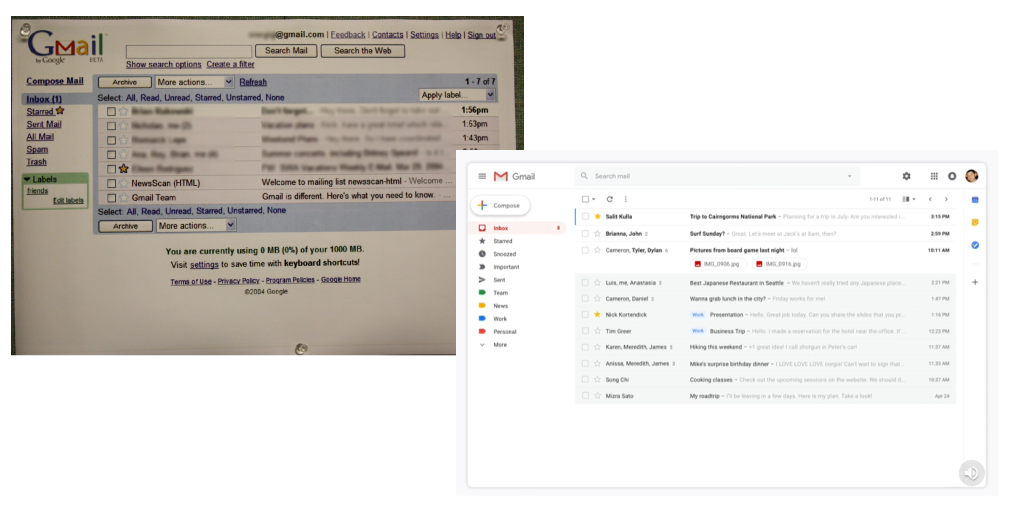
The above-attached image is the screenshot of Gmail then vs now. The one thing that is common in the above image is the overall layout. Over these years there are lots of improvements made in Gmail’s UI components which drastically improved the user experience of Gmail most importantly without tampering the existing experience.
Product Redesign is not a one-man show, it is teamwork, where we need to collaborate with different stakeholders like the Product Owner, Developers, QA & Support Engineers, and sometimes with the users too. During product redesign, we tend to think about only the visual experience and failed to notice the technical challenges. This creates a confused state between the designers and developers. Before starting the design process, it is important for the designer to understand the platform and technologies that are being used. Certain features or parts of the product are made to work in a certain way due to technical restrictions. So, before we start to redesign a feature, the designer and developer or the feature owner get on a one to one call to discuss the feature and get to know about the other important side of the product, that is the coding side. This ensures a good association with the designer and the developer.
After all the research process, there comes the real part of visual design. Before starting the project, the developers will be busy in setting up their Dev Environment, Researching on different libraries, etc. One major problem with our existing application is missing consistency. To build a strong application we need to build a much stronger and more scalable base both on the technical as well as on the design side.
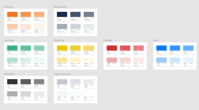
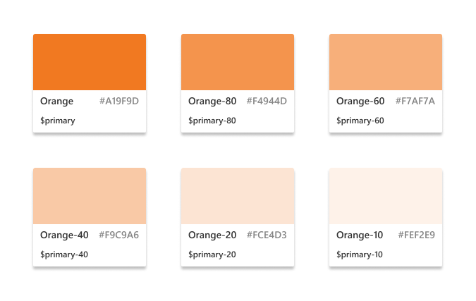
We started by choosing the color palette for our style guide. As we already had our primary and secondary colors, we spent more time on deciding other colors for our application. Our intension is not to confuse users with too many colors. Each color in this palette has its own purpose and characteristics. Along with the main colors, we created also shades for those colors.
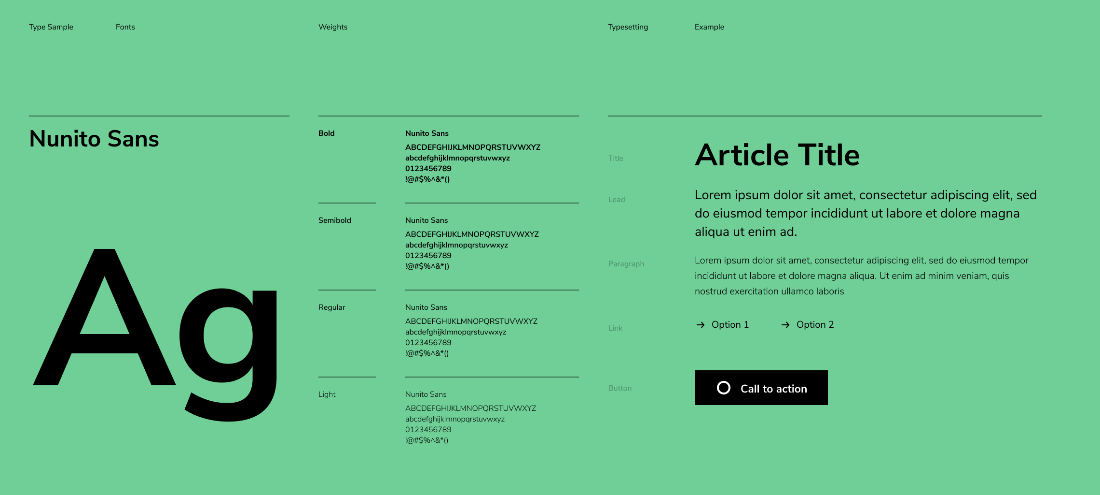
After colors, typography plays an important role. We experimented with different fonts with different weights and strokes. In BizTalk360, data tables are the widely used component, at times there will hundreds of records displayed. So, the fonts should look sharp even at smaller font sizes.

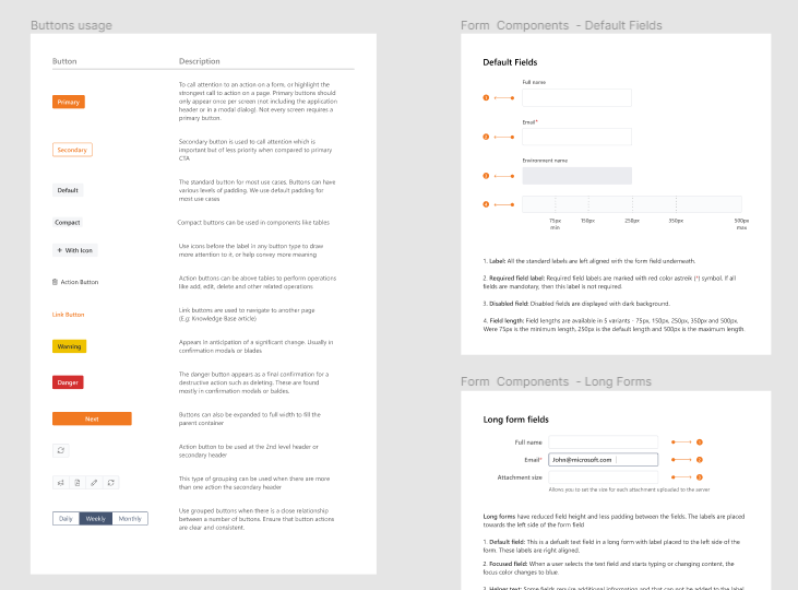
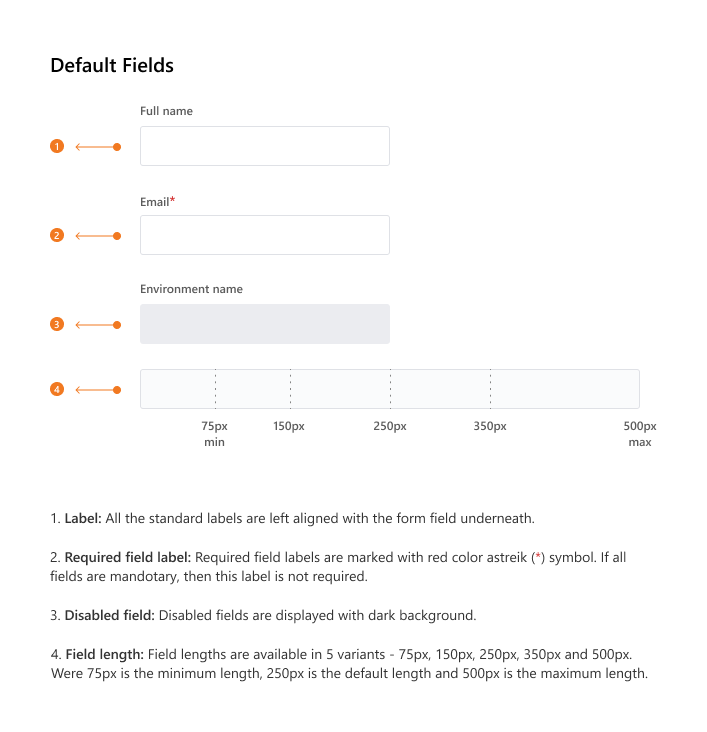
After setting up the style guide, we started designing the components. In the template-driven world, we want to have all the UI components customized as per our requirements. We took inspirations from the world’s top design systems like Fluent by Microsoft, Atlassian Design, IBM Carbon, etc.
We revisited our existing BizTalk360 application and listed down the required UI components. Then we started to design the UI components in such a way that they can scale with the application. We added guidelines to the developers when to use those components and different states like hover, focus, active, etc. This will help the developers to pick up the right component while they are developing and ensures consistency across the board in using UI elements.
Usability testing is the process of testing how easy design is to use by the end-user. It is often conducted repeatedly from the early stages of development till product release. The main purpose of usability testing is to identify any usability problems as early as possible so that they can be addressed before it moves into development. Usability testing is often conducted on prototypes rather than on the finished products.
In a typical usability test, we redesigned one of the most used features the “Data Monitoring Dashboard”. In the existing application, you will see the day calendar view, which lets you understand which data monitoring rules were executed and what was the result. Again, color coding is used for both the type of query (Process Monitoring, Message Box Monitoring, Tracking data Monitoring, etc.) and the result of the validation.
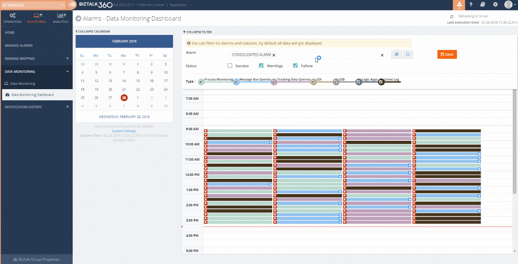
If there are large amounts of data, it will be displayed in consecutive order, making it hard for the user to navigate between the data. Also, the user must select each record to view the details.
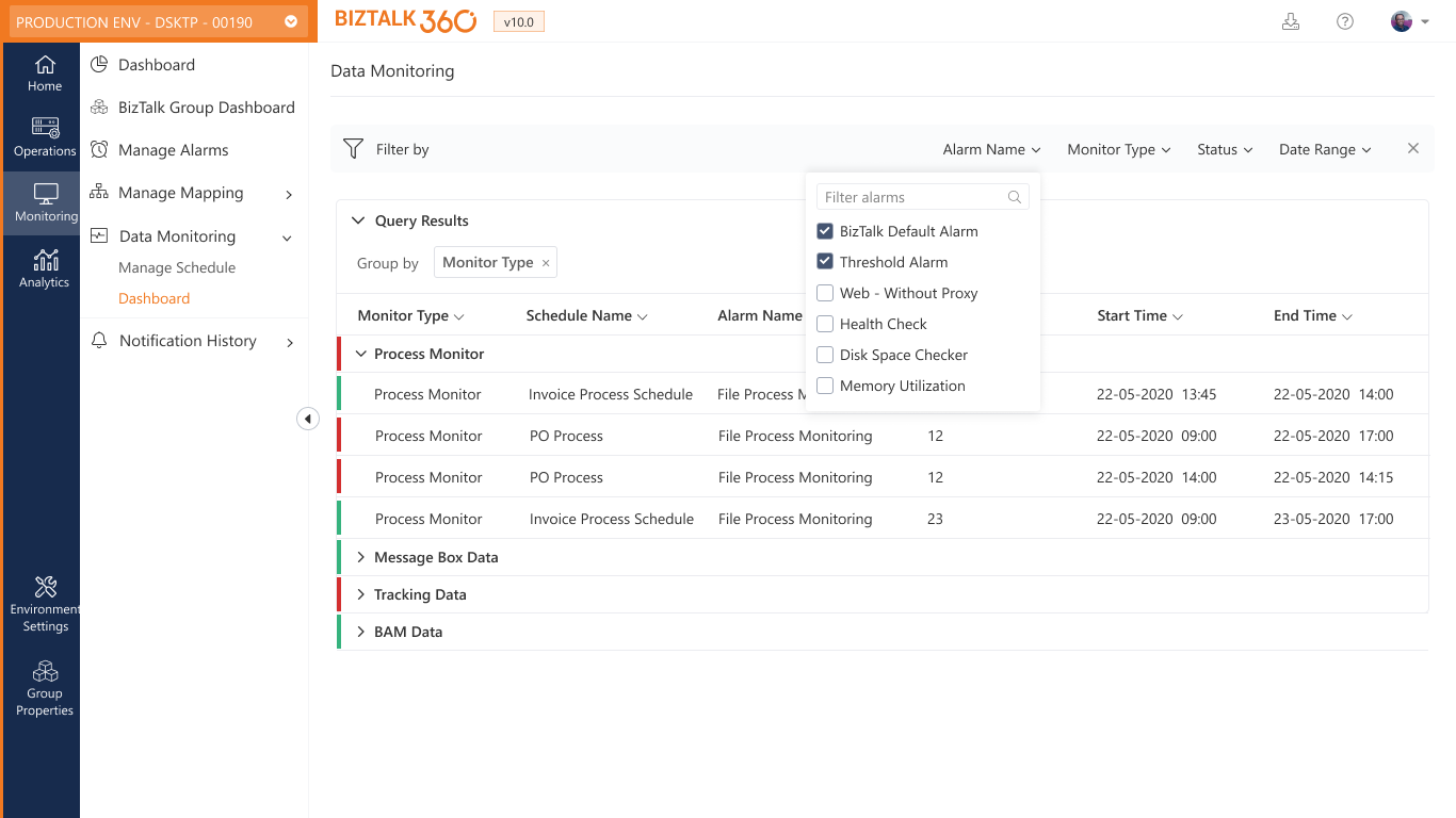
To address this challenge, we thought of bringing in a grid view, where users have access to preview the data in one go. Also, we provided users with different filters to get a focused view of the data.
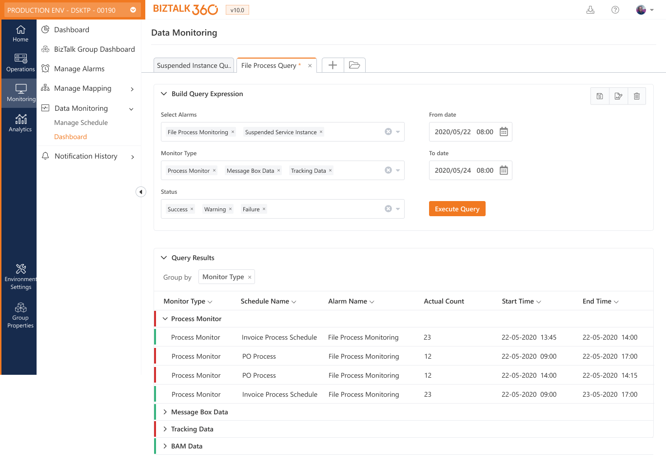
We designed this screen and conducted a usability test by making this screen a clickable prototype and shared with some of our users, who widely uses this feature.
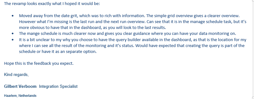
One common feedback we received from our users is that while adding the filters, the actual data moves to the next scroll of the application. So, we started to rethink the filter experience because this type of filter is used in different features of BizTalk360. After many iterations and testing, we came up with the new filter component which occupies 1/10th of the space comparing with the previous filter component.
We are super excited about this massive release and can’t wait to show you what we have built. Keep following our social handles for more updates and news about BizTalk360.
Twitter, LinkedIn, Facebook